Our brand is one word: Toro. This single word, within a red shield, is our most widely recognized trademark. Proper use of the logo reinforces the brand and increases its value. The Toro logo is used on all products, digital media, marketing materials and official communications to transact business.
Do not recreate or alter the Toro logo. Any logo you need is available within our download section. If you are unable to find the logo you need, contact Branden Happel or brand.manager@toro.com.
Our logo consists of two parts that must always be used as one element:
- Shield — The red box in which the TORO logotype is placed.
- Logotype — Always shown in white, centered inside the shield and accompanied by the ® registered mark that rests on the same baseline as the logotype.
Outlined Logo
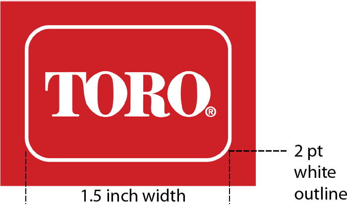
When reproducing the logo on a background of the same color as the Toro shield, use a thin white rule to outline the shield. The weight of the outline is 2 points on a logo that is 1.5" in width.
Logo with Tagline: Horizontal & Stacked
When the Toro logo is used together with the 'Count on it.' tagline, it is referred to as the Toro signature. The tagline should always be set in the typeface Leviathan with proper spacing. For certain situations, where the preferred treatment does not work, such as vertical banners, it is acceptable to use a stacked version.
Preferred Signature

Stacked Signature

The 'Count on it.' tagline only appears in English.
Unacceptable Logo Usage