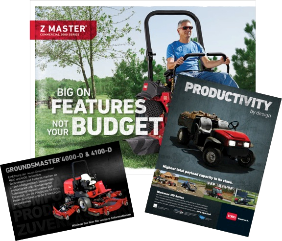
Type Philosophy
Our type system is built around DIN Next LT Pro as the primary sans-serif family, paired with Adobe Garamond for select serif applications. This combination balances readability with Toro's confident, durable brand personality.
Display Face

Body Copy

Secondary Body Copy

Secondary Copy

Sans Serif Display
DIN Next LT Pro – Heavy, Black, and Bold faces are highly legible and flexible for most applications. If a thinner version is needed, use the "condensed" version of these faces. Do NOT manipulate the horizontal % unless necessary.
Used for:
- Headlines
- Subheads
- Large type for outdoor and in-store applications
Formatting:
- Kerning = -10
- Use tighter leading to reflect our solid, durable brand
Sans Serif: Subheads & Main Body Copy
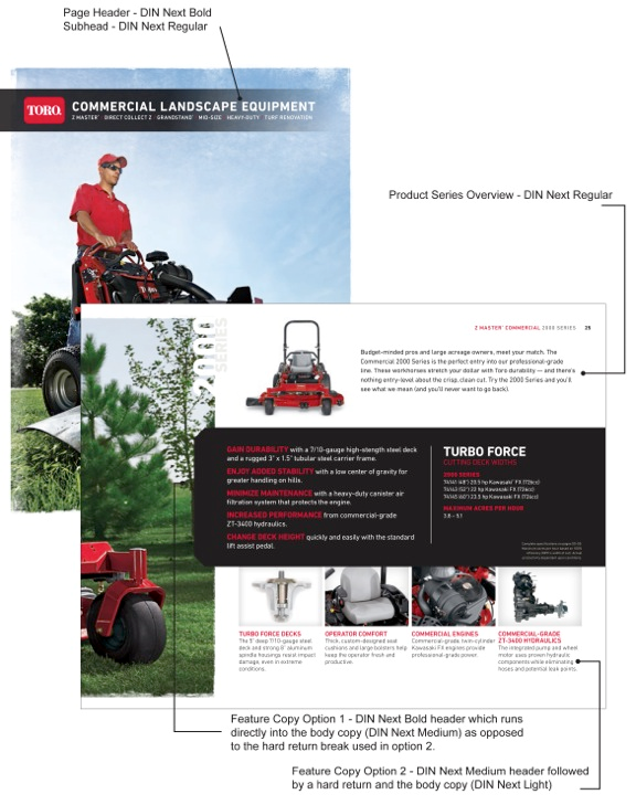
DIN Next LT Pro – Regular, Medium and Bold work best for large amounts of body copy because they are highly legible. It is also acceptable to use them in italics when needed.
Use for:
- Subheads
- Large blocks of text
- Captions
- Bullet points

Sans Serif: Short Blocks of Text, Captions, Disclaimers
DIN Next LT Pro – Light, Condensed and Regular should be used in areas where a lot of text needs to fit in a small space. These condensed fonts are acceptable to use in italic and bold format.
Use for:
- Short blocks of text
- Specifications tables
- Captions
- Disclaimers
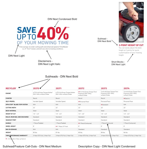
Improper Usage of DIN Next
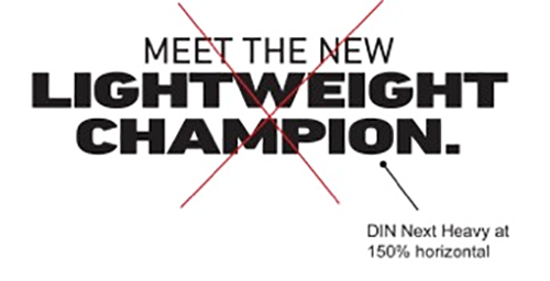
Do not manipulate the standard DIN Next fonts. Instead, choose a weight that fits your design. When manipulated it diminishes the integrity of the font and makes them difficult to read. DIN Next was chosen because of its readability qualities and choice of weights.
Do not manipulate the horizontal
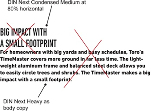
Do not use bold or heavy for body copy when font size is small
Serif Font
Adobe Garamond – Regular, Italic, Semibold, and Semibold Italic, may be used if a serif font is needed.
Used for:
- Captions
- Quotes or reviews
Examples: Use of DIN Next in Marketing Materials

Distressed Font Usage
In special circumstances DIN Next may be altered to have a distressed look in headlines. This would be used in special circumstances where we want to convey a more rugged feel for our products, such as: SWS, Underground, Landscape Contractor Equipment and Commercial.
DIN Next Heavy, Heavy Condensed and Black may be altered with the following graphic and formula:
- Create your type at the exact size you'd like it
- Select the type, and within InDesign, under Type, select Create Outlines
- Ungroup the selection (found under Object)
- Select the outlined type, go to the Pathfinder palette and select Add
- Remove the color fill from the outlined type
- Under Object, go to Content and select Graphic
You can now fill the block of outlined text as though it were a normal picture box. Place the image "scratchy.psd" inside your new picture box (outlined type), sizing it to 100% and roughly centering it.