Product Name Standards
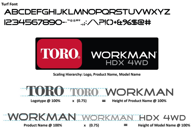
Product names should always appear in the Turf typeface with the exception of mobile applications and software interfaces dedicated to a specific product, and some of our internationally sold products. On-product graphics can be used on certain apparel and merchandise items, and should be requested directly from Industrial Design.
When using the Turf font for on-product branding, the preferred placement of the product name is to the right of the Toro logo and on the same baseline as the logotype. In some instances where the preferred positioning is not ideal, the product name can either be placed on the left side of the Toro logo or stacked directly beneath the logo.
The product name is always subordinate to the logo and should be no more than 75% of the cap-height of the TORO logotype. When placed on Toro's signature red, the product name is shown in black (preferred) or white. When placed on black, the product name is always shown in white.
For Mobile Applications and Software Product Branding
On mobile applications and software interfaces/programs related to a specific product (e.g. Lynx, Sentinel, etc.), the product name should appear in DIN Next LT Pro Bold and in the color Black (#000000). The product name should include the appropriate trademark, and rest on the same baseline and be the same height as the TORO logotype in the shield.
Spacing between the logo and product name is the height of the "T" in the logotype. For other applications, it is acceptable to use only the Toro logo by itself or the Toro logo with the "Count on it" tagline.